How can we make the H5P Editor even better?
H5P is a community driven project, and feedback from the community is a vital contribution in the development of H5P. Please help make the H5P editor even better!
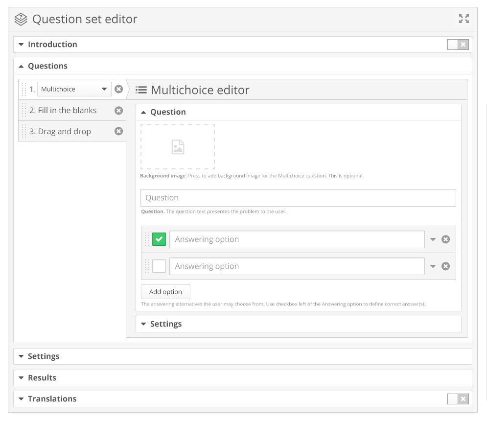
An upgrade of the design and functionality of the generic H5P editor has been proposed by Joubel. See the interactive hotspots below for a quick overview of some proposed new features.
Here are the highlights of the upgrade proposal:
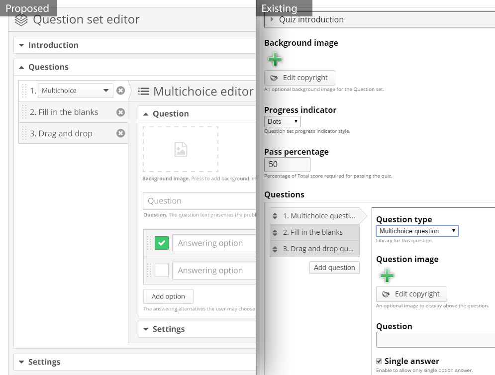
- The height of the editor is minimized to fit more information above the fold in your browser while editing.
- All elements of the editor have been grouped into collapsible sections, which makes it easier to get an overview and hide sections that are not in your focus.
- All but the essential sections collapse when the editor loads in order to highlight the most vital input fields and a more dynamic information load.
- A "distraction free" editing mode, where the editor is viewed in fullscreen and everything but the actual editor is hidden temporarily.
- On/off switches to turn additional features on/off. E.g. to enable an Introduction in a Question set, you switch on the Introduction and this section will expand.
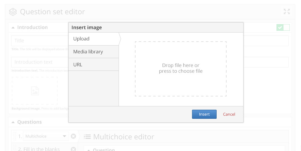
- Improved media handling, which gives you the option to embed media from a URL and insert media from a library of already uploaded files.
- All editable GUI text are grouped together in a section called "Translations".
- General improvement in grouping fields and functionality in the editor. E.g. all settings are grouped together in a section called "Settings".
You can find some screenshots below with more details.
Please comment below to have your saying. Your feedback is much appreciated.
Thanks!
Screenshots
Image 1: Overview. On/off switches to turn on additional options. Editor height is minimized and provides better focus and quicker access to vital options.
Image 2: Comparison with existing editor
Image 3: Improved media handling
What do you think? Let the community know by commenting below!


Comments
liumwei
Wed, 03/18/2015 - 07:55
Permalink
how to handle the error "Unable to load libraries"?
when I create content in Drupal 7, the error comes "Unable to load libraries".
falcon
Wed, 03/18/2015 - 11:21
Permalink
Have you got the newest
liumwei
Wed, 03/18/2015 - 12:49
Permalink
H5p just as 7.x-1.4
I am using H5P 7.x-1.4 on Drupal 7.34 hosting on Ubuntu Linux Server 12.04. Yes, the error "Unable to load libraries" always happen without other related errors. Except that, errors happen and messages come when I use the module of view. :
" An AJAX HTTP error occurred. HTTP return code: 200
Debug information below. Path:? / Q = admin / structure / views / view / node_results / preview / page / ajax
Status Text: OK
Response text:
[{"command":"settings","settings":{"basePath":"\/","pathPrefix":"","ajaxPageState":{"theme":"seven","theme_token":"th1idwZg0aQQqHQkz5c5jxo6HgNGwjTjQVGnDSxo5GM","jquery_version":"1.10","css":{"public:\/\/css\/simplemenu-e64f49e8e8573f18577812422633a8317be487fdef733a5c4fed4d7a3dedd667.css":1,"modules\/simplemenu\/themes\/original\/original.css":1},"js":{"public:\/\/js\/simplemenu_JWEdmxuUbKt9I79LfBZ6hAOorls1QbXE8a0-twdqv-0.js":1,"modules\/simplemenu\/simplemenu.js":1,"modules\/simplemenu\/superfish-1.4.1.js":1}},"simplemenu":{"effect":"opacity","effectSpeed":"fast","element":"body","placement":"prepend","hideDelay":800,"detectPopup":1},"viewsImplicitFormSubmission":{"views-ui-preview-form":{"defaultButton":"preview-submit"}},"ajax":{"preview-submit":{"wrapper":"views-preview-wrapper","event":"click","progress":{"type":"throbber"},"method":"replaceWith","url":"\/?q=admin\/structure\/views\/view\/node_results\/preview\/page\/ajax","submit":......"
falcon
Wed, 03/18/2015 - 13:28
Permalink
It seems the response text
liumwei
Wed, 03/18/2015 - 13:55
Permalink
thanks, the entire repose looks like
An AJAX HTTP error occurred.
HTTP return code: 200
Debug information below.
Path:? / Q = admin / structure / views / ajax / display / node_results / page / style_options
Status Text: OK
Response text:
[{"command":"settings","settings":{"basePath":"\/","pathPrefix":"","ajaxPageState":{"theme":"seven","theme_token":"th1idwZg0aQQqHQkz5c5jxo6HgNGwjTjQVGnDSxo5GM","js":{"misc\/tableheader.js":1}},"simplemenu":{"effect":"opacity","effectSpeed":"fast","element":"body","placement":"prepend","hideDelay":800,"detectPopup":1},"CTools":{"dependent":{"edit-style-options-info-name-align":{"values":{"edit-style-options-columns-name":["name"]},"num":1,"type":"hide"},"edit-style-options-info-name-separator":{"values":{"edit-style-options-columns-name":["name"]},"num":1,"type":"hide"},"edit-style-options-info-name-sortable":{"values":{"edit-style-options-columns-name":["name"]},"num":1,"type":"hide"},"edit-style-options-info-name-default-sort-order":{"values":{"edit-style-options-columns-name":["name"],"edit-style-options-info-name-sortable":[1]},"num":2,"type":"hide"},"edit-default-name":{"values":{"edit-style-options-columns-name":["name"]},"num":1,"type":"hide"},"edit-style-options-info-name-empty-column":{"values":{"edit-style-options-columns-name":["name"]},"num":1,"type":"hide"},"edit-style-options-info-started-align":{"values":{"edit-style-options-columns-started":["started"]},"num":1,"type":"hide"},"edit-style-options-info-started-separator":{"values":{"edit-style-options-columns-started":["started"]},"num":1,"type":"hide"},"edit-style-options-info-started-sortable":{"values":{"edit-style-options-columns-started":["started"]},"num":1,"type":"hide"},"edit-style-options-info-started-default-sort-order":{"values":{"edit-style-options-columns-started":["started"],"edit-style-options-info-started-sortable":[1]},"num":2,"type":"hide"},"edit-default-started":{"values":{"edit-style-options-columns-started":["started"]},"num":1,"type":"hide"},"edit-style-options-info-started-empty-column":{"values":{"edit-style-options-columns-started":["started"]},"num":1,"type":"hide"},"edit-style-options-info-finished-align":{"values":{"edit-style-options-columns-finished":["finished"]},"num":1,"type":"hide"},"edit-style-options-info-finished-separator":{"values":{"edit-style-options-columns-finished":["finished"]},"num":1,"type":"hide"},"edit-style-options-info-finished-sortable":{"values":{"edit-style-options-columns-finished":["finished"]},"num":1,"type":"hide"},"edit-style-options-info-finished-default-sort-order":{"values":{"edit-style-options-columns-finished":["finished"],"edit-style-options-info-finished-sortable":[1]},"num":2,"type":"hide"},"edit-default-finished":{"values":{"edit-style-options-columns-finished":["finished"]},"num":1,"type":"hide"},"edit-style-options-info-finished-empty-column":{"values":{"edit-style-options-columns-finished":["finished"]},"num":1,"type":"hide"},"edit-style-options-info-points-align":{"values":{"edit-style-options-columns-points":["points"]},"num":1,"type":"hide"},"edit-style-options-info-points-separator":{"values":{"edit-style-options-columns-points":["points"]},"num":1,"type":"hide"},"edit-style-options-info-points-sortable":{"values":{"edit-style-options-columns-points":["points"]},"num":1,"type":"hide"},"edit-style-options-info-points-default-sort-order":{"values":{"edit-style-options-columns-points":["points"],"edit-style-options-info-points-sortable":[1]},"num":2,"type":"hide"},"edit-default-points":{"values":{"edit-style-options-columns-points":["points"]},"num":1,"type":"hide"},"edit-style-options-info-points-empty-column":{"values":{"edit-style-options-columns-points":["points"]},"num":1,"type":"hide"},"edit-style-options-info-max-points-align":{"values":{"edit-style-options-columns-max-points":["max_points"]},"num":1,"type":"hide"},"edit-style-options-info-max-points-separator":{"values":{"edit-style-options-columns-max-points":["max_points"]},"num":1,"type":"hide"},"edit-style-options-info-max-points-sortable":{"values":{"edit-style-options-columns-max-points":["max_points"]},"num":1,"type":"hide"},"edit-style-options-info-max-points-default-sort-order":{"values":{"edit-style-options-columns-max-points":["max_points"],"edit-style-options-info-max-points-sortable":[1]},"num":2,"type":"hide"},"edit-default-max-points":{"values":{"edit-style-options-columns-max-points":["max_points"]},"num":1,"type":"hide"},"edit-style-options-info-max-points-empty-column":{"values":{"edit-style-options-columns-max-points":["max_points"]},"num":1,"type":"hide"},"edit-style-options-grouping-0-rendered":{"values":{"edit-style-options-grouping-0-field":["name","started","finished","points","max_points"]},"num":1,"type":"hide"},"edit-style-options-grouping-0-rendered-strip":{"values":{"edit-style-options-grouping-0-field":["name","started","finished","points","max_points"]},"num":1,"type":"hide"}}}},"merge":true},{"command":"insert","method":"prepend","selector":"head","data":"\u003Cscript type=\u0022text\/javascript\u0022 src=\u0022http:\/\/liumwei.bioinfoserv.org\/misc\/tableheader.js?nlerv4\u0022\u003E\u003C\/script\u003E\n","settings":null},{"command":"viewsSetForm","output":"\u003Cform action=\u0022\/?q=admin\/structure\/views\/ajax\/display\/node_results\/page\/style_options\u0022 method=\u0022post\u0022 id=\u0022views-ui-edit-display-form\u0022 accept-charset=\u0022UTF-8\u0022\u003E\u003Cdiv\u003E\u003Cdiv class=\u0022views-override clearfix container-inline\u0022\u003E\u003Cdiv class=\u0022form-item form-type-select form-item-override-dropdown\u0022\u003E\n \u003Clabel for=\u0022edit-override-dropdown\u0022\u003EFor \u003C\/label\u003E\n \u003Cselect id=\u0022edit-override-dropdown\u0022 name=\u0022override[dropdown]\u0022 class=\u0022form-select\u0022\u003E\u003Coption value=\u0022default\u0022\u003EAll displays\u003C\/option\u003E\u003Coption value=\u0022page\u0022\u003EThis page (override)\u003C\/option\u003E\u003C\/select\u003E\n\u003C\/div\u003E\n\u003C\/div\u003E\u003Cdiv class=\u0022scroll form-wrapper\u0022 id=\u0022edit-options\u0022\u003E\u003Cdiv class=\u0022description form-item\u0022\u003EPlace fields into columns; you may combine multiple fields into the same column. If you do, the separator in the column specified will be used to separate the fields. Check the sortable box to make that column click sortable, and check the default sort radio to determine which column will be sorted by default, if any. You may control column order and field labels in the fields section.\u003C\/div\u003E\u003Ctable class=\u0022sticky-enabled\u0022\u003E\n \u003Cthead\u003E\u003Ctr\u003E\u003Cth\u003E\u5b57\u6bb5\u003C\/th\u003E\u003Cth\u003EColumn\u003C\/th\u003E\u003Cth\u003EAlign\u003C\/th\u003E\u003Cth\u003ESeparator\u003C\/th\u003E\u003Cth align=\u0022center\u0022\u003ESortable\u003C\/th\u003E\u003Cth align=\u0022center\u0022\u003E\u9ed8\u8ba4\u987a\u5e8f\u003C\/th\u003E\u003Cth align=\u0022center\u0022\u003EDefault sort\u003C\/th\u003E\u003Cth align=\u0022center\u0022\u003EHide empty column\u003C\/th\u003E \u003C\/tr\u003E\u003C\/thead\u003E\n\u003Ctbody\u003E\n \u003Ctr class=\u0022odd\u0022\u003E\u003Ctd\u003E(\u7528\u6237) \u540d\u79f0\u003C\/td\u003E\u003Ctd\u003E\u003Cdiv class=\u0022form-item form-type-select form-item-style-options-columns-name\u0022\u003E\n \u003Cselect id=\u0022edit-style-options-columns-name\u0022 name=\u0022style_options[columns][name]\u0022 class=\u0022form-select\u0022\u003E\u003Coption value=\u0022name\u0022 selected=\u0022selected\u0022\u003E(\u7528\u6237) \u540d\u79f0\u003C\/option\u003E\u003Coption value=\u0022started\u0022\u003E(H5P) Start time\u003C\/option\u003E\u003Coption value=\u0022finished\u0022\u003E(H5P) Finish time\u003C\/option\u003E\u003Coption value=\u0022points\u0022\u003E(H5P) Points awarded\u003C\/option\u003E\u003Coption value=\u0022max_points\u0022\u003E(H5P) Max points awarded\u003C\/option\u003E\u003C\/select\u003E\n\u003C\/div\u003E\n\u003C\/td\u003E\u003Ctd\u003E\u003Cdiv class=\u0022form-item form-type-select form-item-style-options-info-name-align\u0022\u003E\n \u003Cselect id=\u0022edit-style-options-info-name-align\u0022 name=\u0022style_options[info][name][align]\u0022 class=\u0022form-select\u0022\u003E\u003Coption value=\u0022\u0022 selected=\u0022selected\u0022\u003E\u65e0\u003C\/option\u003E\u003Coption value=\u0022views-align-left\u0022\u003ELeft\u003C\/option\u003E\u003Coption value=\u0022views-align-center\u0022\u003E\u4e2d\u003C\/option\u003E\u003Coption value=\u0022views-align-right\u0022\u003ERight\u003C\/option\u003E\u003C\/select\u003E\n\u003C\/div\u003E\n\u003C\/td\u003E\u003Ctd\u003E\u003Cdiv class=\u0022form-item form-type-textfield form-item-style-options-info-name-separator\u0022\u003E\n \u003Cinput type=\u0022text\u0022 id=\u0022edit-style-options-info-name-separator\u0022 name=\u0022style_options[info][name][separator]\u0022 value=\u0022\u0022 size=\u002210\u0022 maxlength=\u0022128\u0022 class=\u0022form-text\u0022 \/\u003E\n\u003C\/div\u003E\n\u003C\/td\u003E\u003Ctd align=\u0022center\u0022\u003E\u003Cdiv class=\u0022form-item form-type-checkbox form-item-style-options-info-name-sortable\u0022\u003E\n \u003Cinput type=\u0022checkbox\u0022 id=\u0022edit-style-options-info-name-sortable\u0022 name=\u0022style_options[info][name][sortable]\u0022 value=\u00221\u0022 class=\u0022form-checkbox\u0022 \/\u003E\n\u003C\/div\u003E\n\u003C\/td\u003E\u003Ctd align=\u0022center\u0022\u003E\u003Cdiv class=\u0022form-item form-type-select form-item-style-options-info-name-default-sort-order\u0022\u003E\n \u003Cselect id=\u0022edit-style-options-info-name-default-sort-order\u0022 name=\u0022style_options[info][name][default_sort_order]\u0022 class=\u0022form-select\u0022\u003E\u003Coption value=\u0022asc\u0022 selected=\u0022selected\u0022\u003EAscending\u003C\/option\u003E\u003Coption value=\u0022desc\u0022\u003EDescending\u003C\/option\u003E\u003C\/select\u003E\n\u003C\/div\u003E\n\u003C\/td\u003E\u003Ctd align=\u0022center\u0022\u003E\u003Cdiv class=\u0022form-item form-type-radio form-item-style-option
falcon
Thu, 03/19/2015 - 11:48
Permalink
If that is the complete
If that is the complete response the problem is that for some reason your server doesn't return all the data about the installed libraries. It's very hard for us to debug without access to your site. If you want to give us access you can do it through the H5P contact page.
liumwei
Wed, 03/18/2015 - 14:03
Permalink
I wonder that
the response text is related to the error "Unable to load libraries"?